East Coast Chair & Barstool is a Mercer, Pennsylvania-based bar and restaurant furniture dealer. At their eBay store, shoppers will find new and discount hospitality furniture of all kinds and in the most popular styles and materials to suit every need.
The company was founded in 2002 as an online hobby but after a decade of increasing profits and growth, the Pennsylvania business decided to expand their line of furniture, even adding wood tables and chairs handcrafted by artisans in the nearby Amish community. So how does an online furniture company distinguish itself on the world’s most competitive marketplace? OC Designs Online had some eBay store design ideas.
Never underestimate white space. Many an online merchant sees white on their web store’s landing page and then they see red. The idea is that white space is a spot where shoppers can view product and get information on inventory. But any designer worth her salt knows that white space reduces cognitive load (burdening the eye with too much information). Done correctly, it can be calming and even strategic, directing shoppers to specific areas of the page.
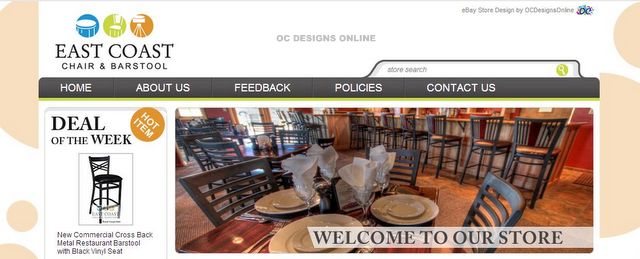
 Since the first thing a person does when they land on a new webpage is scan for pertinent information. White space helps organize a cluttered, distracting layout. That is exactly how OC Designs Online approached East Coast. The heading text, the white strip at the top of the page, contains the company’s name and logo, which includes three primary theme colors — blue, green and orange.
 By assigning the theme colors double duty — as identification for East Coast Chair & Barstool and the site’s anchor colors — the page feels grounded, stable and even uplifting.
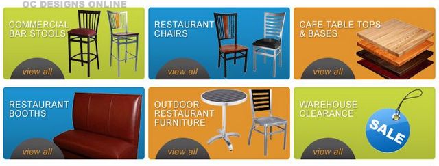
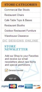
OC Designs Online provides East Coast shoppers with popular category links, utilizing the company’s theme colors, making it easy for buyers to instantly hone in on specific inventory. But not all shoppers are attracted to bold colors prefer scanning the page for a list of categories, like the one positioned down the left column — prime real estate for a webpage.
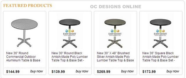
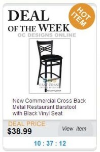
“Featured products” is a section that shoppers are drawn to for its implied urgency. The idea is that these items are too popular to stick around or that an auction clock will soon take them off the market. The chairs and stools featured here in white boxes do not initiate a sense of urgency, but by setting this section apart from the mid-page color explosion, shoppers can’t help but notice the highlighted inventory.
Need some ideas for your online store? Peruse our portfolio or go to our Pinterest page for inspiration. By liking us on Facebook, you’ll be first to hear about deals.
Ready for a new eBay store design? Request a free quote!


