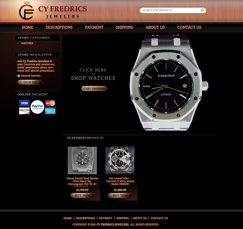
Our recent client, CY Fredrics, sells watches in their eBay storefront. We have worked with many eBay jewelers but this has got to be one of our favorite designs in this category because it breathes elegance in a colorful way, which is very hard to do when selling jewelry.
Welcome images sell more products
In the majority of the stores we design for, we use welcome images to emphasize certain categories or products. These sections are always some of the most clicked areas in stores, so we usually make this image link to all of the items a store has to offer so that a customer will want to browse more and in turn, add more to their shopping cart.
Showing payment options shares value
Beneath the different jewelry categories CY Fredrics sells in their eBay store we added a banner that shows different online payment options, including that our client is Paypal verified. This shows customers that they can trust our client with their money since they will be backed by Paypal’s business practices.
The ombre colors create a calming ambiance
Our favorite part of this eBay store is the ombre of pink, orange, red, and black colors we mixed into this design. These tones create a calming feel that makes shopping more enjoyable for customers.
The logo we created also adds to the feel of this store’s elegance, the C and F blend together with a crown on top to embody the luxury of their items.
If you want your store to succeed, contact us for a free quote
eBay stores that have professional designs set an impression and expectation for customers that you are in business and ready to accept their patronage. We at OCDesignsonline can help you succeed and boost sales. All you need to do is request your free quote to get started.
OCDesignsonline has a wide array of eBay listing templates to choose from on the site. Take a moment to browse our portfolio and request a free quote. Also, don’t forget to find us on Facebook, follow us on Twitter and check out our Google+ Page too!


