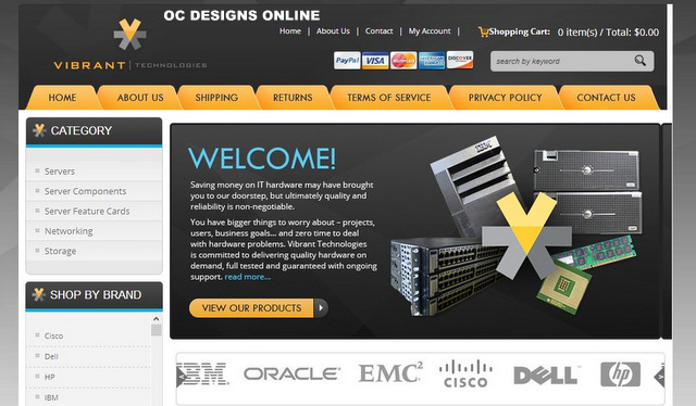
Vibrant Technologies has teamed up with OC Designs Online to give buyers a superior shopping experience. The 3dCart store design utilizes ebony, goldenrod, light-gray and light blue as its main color schemes.
At the top of the page, the shopper notes Vibrant Technologies’ name and logo. There are clickable links that take the buyer to the home page, to an “about us” listing, a contact option and an account log-in prompt. A shopping cart listing shows the buyer a running total of items and dollars.
 Right below this selection is a listing of accepted payment options and a search bar that invites shoppers to enter a keyword for a product search. Next, there is a horizontal row of tabs. Some of these tabs offer clickable links that duplicate the listing at the top of the page.
The new links offer the buyer access to shipping policies, returns, terms or service and the store’s privacy policy. What makes these 3dCart store templates so effective is the use of clear category links. For example, underneath the tabs is a welcome message and product viewing link, which offers yet another search mechanism for the consumer.
For the shopper who prefers to browse by category, there is a vertical collection of links to the left. It allows access to popular products such as networking hardware, servers and storage devices. Below this listing is the option to shop by brand. The buyer may select from a large list of well-known manufacturers of IT hardware. Examples include Apple, HP and IBM.
It is interesting to note that underneath the welcome message and photo, there is a crawler that displays the logos of the most famous IT hardware producers. For the shopper who may not remember a name but recognizes a logo, this is a great option. To further simplify the shopping experience, there are six clickable boxes that feature major manufacturers and highlight their main product categories. These companies are the same that have their logos displayed on the crawler.
Moving back to the left side of the page, the shopper finds testimonials from satisfied customers and information boxes noting free, combined and international shipping policies. To the right, there is a listing of featured products. They represent a cross section of the available items a buyer may select when searching for IT hardware.
The store designers finish the design with a repeat of the yellow coloring that sets apart the tabs at the top. It colors a box that urges customers not to miss another deal but to make sure that they sign up with their email address for a newsletter. At the bottom are a shop pages category, a listing of reasons why the buyer can confidently shop at Vibrant Technologies, and an opportunity to connect via social media.
The shopper is given the chance to contact the store by phone as well. With the store name and logo counterbalancing the design of the website’s top, there is a repeat of the links from the top as well.
Let OC Designs Online show you what a 3dCart store design can do to boost site traffic to your store! We are experts in 3dCart template designs and we invite you to browse our ever-growing portfolio.
Contact us about your 3dCart store design—it’s easy to request a quote!
We invite you to like us on Facebook and don’t forget to follow us on Twitter!


