After teaming up with OC Designs Online, Queen Jewelers offers online shoppers access to some of the most stunning jewelry items for sale.
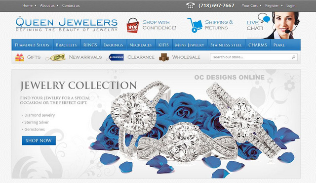
This Volusion store design uses shades of Cerulean to offset elements of Egyptian blue. The backdrop of the site is kept in shades of light and Gainsboro gray. White serves as one of the font colors for clickable links.
At the top of the page, shoppers notice links to the home page, a brief history of the store and a contact option. To the right, there is a phone number for voice contact and a cart summary. Customers may choose to register or log into their accounts. Next comes Queen Jewelers’ store name and logo. A link to the store’s shipping and returns policies as well as an invitation to a live chat round out the top portion of the page.
A bank of horizontal tabs gives the online customer an opportunity to narrow down the selection of jewelry pieces to peruse. Diamond studs, bracelets, rings, earrings, necklaces, kids’ pieces, men’s jewelry, stainless steel, charms and pearls are the categories to pick. Once the interested shopper hovers the mouse over these options, additional categories pop up. They make it easy to quickly narrow down the search for particular pieces.
Right below this bar, the buyer finds supplementary search options. Items best suited as gifts have been grouped together. There are also groupings for new arrivals, clearance items and wholesale pieces. A keyword search bar offers yet another search option.
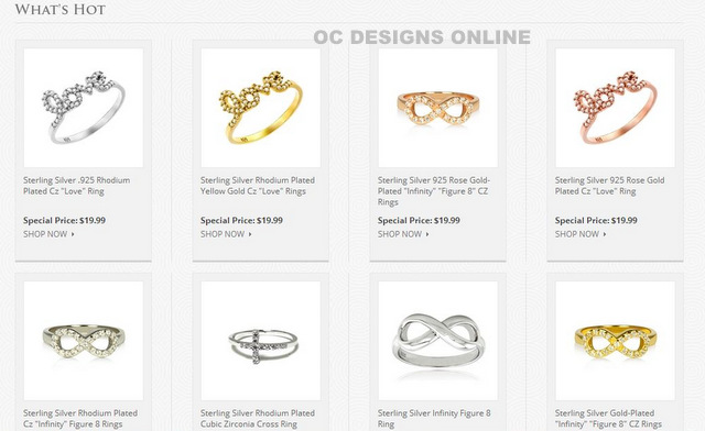
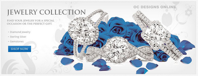
The middle of the page is taken up by an attractive photo of pieces belonging to the jewelry collection. The shopper chooses from diamond, Sterling silver or gemstone pieces. A “shop now” link takes the buyer to a collection of rings. Underneath this photo, there is a repeat of the product options noted in the tabs. In this case, they feature attractive photos to inspire the customer who is not certain about the types of pieces to look at. A “what’s hot” section highlights eight photos of attractive jewelry items.
To balance the attractive look of this Volusion store design, OC Designs Online and Queen Jewelers chose to place a newsletter subscription option at the bottom of the page. Going down further, there are explanations of accepted payment options, site certifications and customer links taking the shopper to company info, an account, a site map and customer service links. The name and logo of the store balances out the page’s look at the bottom right.
At OC Designs Online, we have graphic designers that are experts at Volusion store designs—and just about any other ecommerce store design. It’s easy to request a quote—and free!
We hope you’ll browse our stunning portfolio, like us on Facebook and add us to your circles on Google+!


