Are you an Australian ecommerce retailer looking to hit record sales in 2014? Do you sell office supplies, home essentials, children’s toys, outdoor furnishings, or fitness equipment? If you answered ‘all of the above’ a Big Commerce store design could be the perfect platform to organize your diverse inventory offerings.
For Austrailia-based Crazy Wholesales, our team of experts at OC Designs Online were entrusted with getting their shop design cleaned up and ready for their public. Now, thanks to the exceptional layout and highly organized design, they’re selling more than ever and solidifying themselves as the place to shop online.
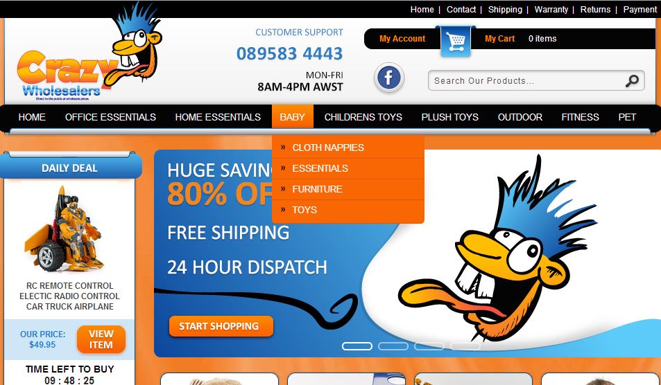
First, a black header at the very top of the page offers customers easy access to contact info and company policies which outline the store’s shipping, warranty, returns and payment specifics.
Next, a convenient plug in clearly displays account information and the number of items currently in the shoppers ‘cart’. A social media icon links buyers directly to Crazy Wholesales’ Facebook page, making it easy to follow them online. Should customers choose to seek out specific products they may use the custom search bar to do so.
Nine overarching store categories each link to additional tabs which can be accessed by hovering the cursor over any one.
In the left sidebar a daily deal counts down to its expiration. Seeing the clock slowly tick backwards is a great way to motivate your shoppers to act fast and make their purchases!
The store’s main welcome message is on a constant rotation. This clever design element is sure to grab the attention of any passerby and is a great way to advertise a sale or special promotion in prime real estate.
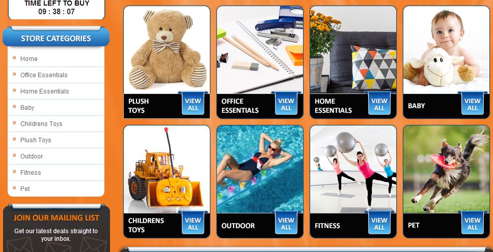
Below, store categories are displayed in two organized ways, appealing to the shopping pallet of a wide range of individuals. The first of which is a vertical list of nine tabs each linking to a full selection of inventory. In the 4 X 2 panel of images to the right, hi-res images underscore each of the panes and offer customers an easy ‘view all’ feature.
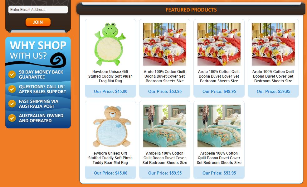
In the midsection, our designers built in a section of featured products and reasons to shop with Crazy Wholesalers above their competition.
Finally, the customer footer closes the storefront by organizing additional links to company or account info, a site map and customer service tabs.
Think the Big Commerce platform is right for your business? If so contact us for a free quote on a custom Big Commerce store design! We hope you’ll like us on Facebook and follow us on Twitter and don’t forget to browse our portfolio of stunning ecommerce store designs!


