The right accessories can make an ordinary outfit seem extraordinary. Even simple jeans and a white t-shirt can look amazing when paired with the right accessories. Watches, earrings, necklaces – they all add a certain charm – and they can transform an outfit from shopping mall to afternoon with the girls. When Hunter Ridge Jewelry asked OCDesignsonline to come up with a new eBay store design for them, we were happy to help.
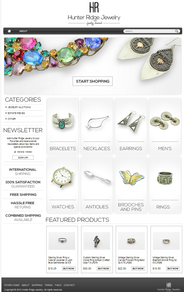
We decided, with our client, to go for a minimalist and clean look for this eBay jewelry store. We kept our design elements to black, white, and gray so that the colors of the jewelry pieces could speak for themselves. We used a similar font throughout the site to the font used in the company’s logo, and we made sure that all of the lines we used on the site were clean. We’re really pleased with how it turned out.
A basic header sets the tone for this eBay store design
We topped the page off by using just the store’s logo at the top of the design. The menu bar under that has a home icon and an “About” tab, and on the other end, there’s the search bar – and that’s it. It really is simple and elegant. The header image we chose to use is a colorful gemstone necklace and fun metal worked earrings- and those two items really stand out against the gradient gray background we created.
Category image buttons keep it simple with singular images of products
In order to best keep the page streamlined, we used image buttons for the categories to make each type of product stand out. While we did create a sidebar with some navigation features, we focused our energy there on creating a space where customers could view the shop’s unique selling points and sign up for the store’s newsletter so they can keep abreast of what’s new and interesting. We also created custom category pages for our client. We kept each of these pages streamlined and clean just like this eBay store’s landing page.
Featured products bring customers back again and again
We created a featured products section for our client so that the customers visiting the site would have an incentive to visit the site on a regular basis. Featured items are those items that are new, on sale, or of particular interest to customers. By regularly updating this section, it gives customers a reason to come back and browse, even after they’ve made purchases.
Let OCDesignsonline help you with your eBay store design and boost your bottom line today
We have a wide array of eBay listing templates from which you may choose. If you’re looking for a new store design, take a moment to browse our portfolio. When you’re ready, request a free quote. For more great design ideas and updates, follow us on your favorite social media page. We’re on Facebook, Twitter, and Google+!


