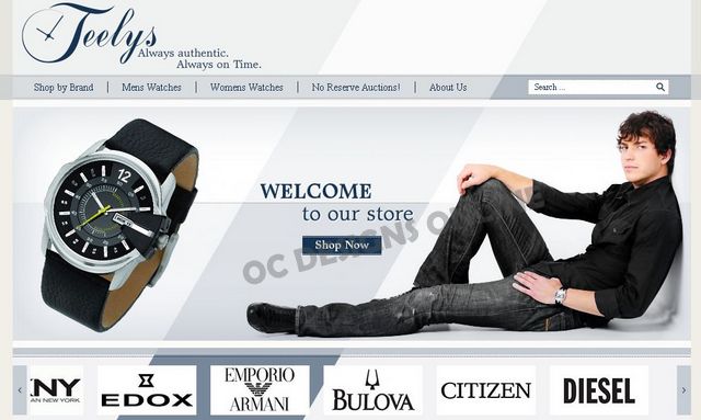
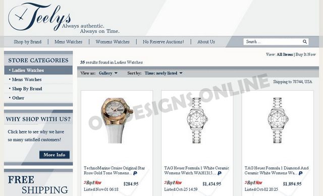
At OC Designs Online, we get excited when one of our eBay store designs is so original we want to brag about it! We did that with Teelys watch store and when you first enter this storefront, it doesn’t seem like you’re in eBay at all!
With a motto of “Always authentic. Always on time” and a large inventory of brand name watches, when we spoke with the folks at Teelys, we knew they wanted something different to build their brand and drive sales.
Upon entering Teelys, you are instantly “welcomed” with watch and model imagery. A scrolling bar shows the multitude of watch brands they sell including some of the most popular like Bulova, Citizen, DKNY, Edox and more! The subtle white and blue background compliment this “welcome into this different” sort of eBay store design.
At the top, along with Teelys logo and catchphrase, shoppers can use the search the store tool or shop by category (women’s or men’s watches) or shop by brand. You can even narrow down your search by clicking on the “no reserve” watch auctions or learn more about Teelys by clicking on the about us tab.
Often simple is best when it comes to eBay store designs, especially when our clients take advantage of our custom storefront designs and matching listing templates. Keeping Teelys’ storefront simple with easy navigation tools, scrolling brands, imagery and some important why buys is all this storefront really needs to succeed.
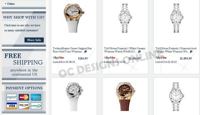
Of course the why buys such as free shipping, a link to their feedback discreetly disguised as a “why shop with us” clickable box, payment options and a store newsletter signup area are essential but by taking advantage of our eBay listing template, Teelys expresses a “welcome to our eBay store and come on in” sort of feel.
When shoppers click on a brand or category, they get the feel of “entering” the store without ever leaving the store because all of the homepage elements stay with our eBay custom listing templates. Shoppers find they can view all listings or look for watches on sale all while enjoying the simple, yet tasteful design of this ecommerce store.
We call our eBay store designs with matching listing templates “Store Solutions” and this eBay combo design product we offer has boosted sales time and time again for many of our clients.
You too can achieve this “come on in” look for your eBay store design by contacting us and we encourage you to browse our custom store design portfolio and some of the eBay matching listing templates we’ve designed and visit each page live!
It’s said the proof is in the pudding meaning to fully test something you need to experience it yourself and our clients tell us that by implementing both a custom eBay store design and matching listing templates, they’ve seen the proof! Ready to get started—just request a quote! Be sure to find us on Facebook where we offer up tons of our success stories and links to all sorts of tips on ecommerce selling!


