When you want to customize your ride, sometimes aftermarket parts are the only way to go, and if you visit Midwest Aftermarket seeking the ideal components, their eBay store design will draw you in right away.
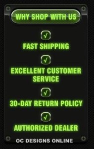
Specializing in performance parts, such as tuners and chips, exhaust systems and air intakes, the store is an authorized dealer of the products it sells. Midwest Aftermarket promises fast shipping, excellent customer service and a 30-day return policy.
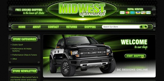
 The neon green against a sleek black background of the eBay store design blends polished professionalism with the thrill of a powerful ride. The green hue first appears at the top of the page with the store’s logo. The word “Midwest” looms large in uppercase, neon block letters and “Aftermarket” emblazons the bottom of the logo in bordered black script with a background that resembles an automotive grill. The logo is flanked with payment and shipping information, which appears to be attached to the page with heavy-duty bolts.
The navigation bar below the primary logo provides instant access to the Home, About, Contact, Returns and Shipping pages as well as a search box that allows visitors to search the store’s products. This bar features the same grill-like backdrop and text with a neon green color that is so realistic, it seems to illuminate the segment.
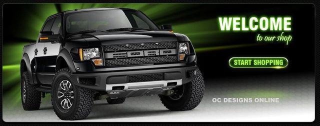
A sizable Welcome section featuring a sleek black Ford pickup helps to set the tone of the eBay page design. Visitors can click anywhere on this section of the page to begin browsing available merchandise.
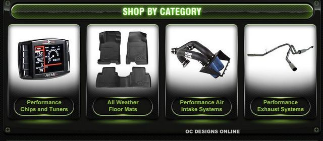
Following the Welcome section is the Shop by Category portion of the page, which is “bolted” to the background like a high-quality truck part. Categories include both legibly identified labels and comprehensible images with white surrounds, which stand out against the dark background of the page design.
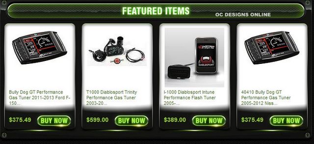
The Featured Items segment is next, utilizing the same structure of the Shop by Category area to display specific parts that are currently available. Each item includes a brief description as well as the sales price.
Further navigation borders the left side of the page with a Store Category section listing available product categories in a more inclusive manner, a store newsletter signup section and details on Midwest Aftermarket’s commitment to excellence.
The store’s design theme continues at the bottom of the page with a small-scale navigation bar, copyright information and a final store logo.
You can find a mediocre eBay store design anywhere, but if you want a scheme that not only captures shoppers’ attention but also captures your store’s personality, consider OC Designs Online. Please peruse our portfolio to see how we might boost your eBay store design, and request a quote to learn more.
Don’t forget to look us up on Facebook, follow us on Twitter and check out our Pinterest boards, too!


