An estimated half of all Americans use vitamins and supplements. Cornering this ecommerce market means finding ways to draw in shoppers — and browsers —to your online store and entice them to buy from you.
This can be incredibly challenging but when Bathhouse Naturals asked OC Designs Online to create a dynamic and standout 3DCart store design, we knew right away a stunning design would help them stand out above their competitors.
Bathhouse Naturals sells a wide variety of vitamins, supplements, weight loss, diet and beauty products. The Orland Park, IL-based company specializes in popular items like HCG drops, green coffee bean extract, krill oil, acai-based products, makeup containing rejuvenating minerals and other skin care products.
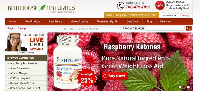
Often, the only difference between an unreliable pop-up supplement dealer and a trustworthy health and beauty retailer like Bathhouse Naturals is an attractive website that’s easy to navigate, has a clear menu of inventory and prominent “contact us” details, like a bold, fire engine red phone number placed at one of the most visible spots on a landing page, the top right corner, adjacent to the company’s name and logo.
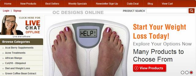
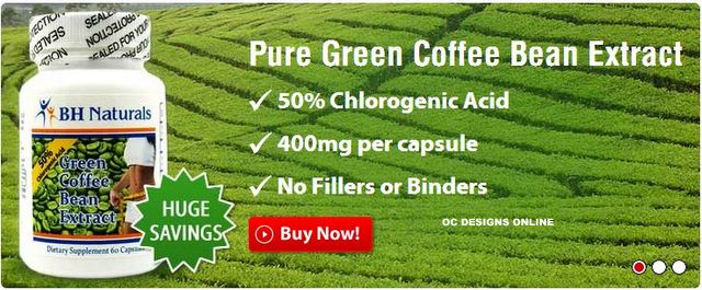
OC Designs Online approached the Bathhouse Naturals 3DCart store design in the most intuitive way possible. We capitalized on three main customer search behaviors. First, a rotating banner stands out immediately with a slideshow of top products customers desire most.
Second, we inserted three top categories that, again, online shoppers seek: Vitamins & Energy, Beauty & Skin Care and Diet & Weight Management. Assigning each of these categories with their own bold and distinctive colors offers consumers a visual imprint to help them easily identify each classification.
Finally, the third search element online shoppers rely on is a more comprehensive menu of categories, which is easily found on the left side of the landing page. Here, we not only included the top searched categories, but also specific items in the drop-down menu, like HCG drops and acai berry supplements so customers can find what they want quickly.
Of course, some customers have a specific product in mind and opt to eliminate click-throughs by simply typing in the product name in the search box, placed conveniently in the top right corner. Notice the bright red sale burst just above? Placing Bathhouse Naturals daily deals hotlink sandwiched between their phone number, basket, order status and help hotlink makes the sale button stand out—online shoppers are drawn to colorful, stand-out buttons and text that include words like Sale, Discounts or Top Sellers. These reinforce what online bargain buying is all about.
Ready for your own 3DCart store design? Let OC Online Designs show you what we can do for your ecommerce store. We invite you to browse our portfolio of ecommerce stores and we’ve worked with many platforms including eBay, Volusion and ChannelAdvisor and more! We also make it easy to request a price quote with a short fill-in form.
Stay up-to-date on everything new and exciting from OC Designs Online—check out our Google+ Page and follow us on Twitter and Facebook!


