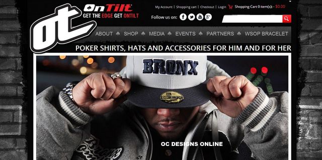
Teaming up with OC Designs Online, OnTilt opted for a BigCommerce store design that predominantly features shades of black and red. Whereas basic black serves as the framing color, the upper navigation bar features a dim gray.
The background fades from dim gray to jet-black toward the bottom of the site. White and pigment red serve as font and button colors, respectively. White also serves as a backdrop to some of the product displays.
At the top of the page, the shopper notices the OnTilt logo to welcome them to the store. To the right of the logo is a small group of clickable links, which take the buyer to a previously established account page, the shopping cart, the checkout and a login prompt.
A shopping cart icon also features the number of items the buyer has currently chosen as well as a running dollar total. Underneath these links are opportunities for consumers to connect with the store via social media using identifiable icons. A search function lets buyers discover available poker gear by keyword.
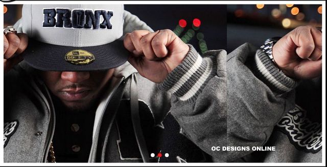
The first major navigation bar gives the shopper the opportunity to learn a little bit more about the store, to shop, see what media OnTilt has generated, find out about scheduled events and get in contact with featured partners. Finally, there is an option of perusing World Series of Poker bracelet products. Below this bar, the store operators highlight that product lines feature poker apparel and unisex accessories. A large three-picture display field features an attractive display of some of the gear buyers can find on the site.
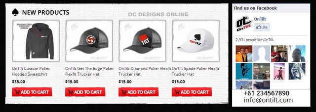
Eye-catching red buttons draw attention to a row of four product categories under the picture display. They separate the products by men’s and women’s poker apparel, accessories and eyewear. Below this display is a selection of four new products shoppers might enjoy. They emphasize the latest additions to the inventory and may spur on the buyer to add another item to the cart before checking out. To the right of this display is a Facebook field that gives shoppers the opportunity to “like” the store via the social network and note the number of fans this business has already accumulated. A phone number and email address round out this section.
Next, OnTilt lets shoppers sign up for a newsletter. The bottom section of the BigCommerce store design is dedicated to four distinct sections. There is an information section with clickable links that leads to customer service. Next is the account section, which is dedicated to order tracking, account sign-in and the setup of a wish list. A store section highlights shipping, returns, secure shopping and international shipping options. Once more, the shopper is invited to connect with OnTilt via social media. At the bottom of the page, the store lists the types of payments it will accept—what an awesome need look our graphic designers created with this BigCommerce design.
Your online store can stand out above your competitors, create a brand and drive more sales with a custom BigCommerce store design. We invite you to browse our portfolio of other BigCommerce designs and then contact us for a quote.
Be sure to find us on Facebook and follow us on Twitter and check out our Google+ Page!


