Robert Coste Builders teamed up with OC Designs Online to bring their vision of custom home building and design consultation to online clients. The colors chosen for the website design feature shades of light blue and white.
The top of the page mimics the appearance of a slightly cloudy blue sky. Red fonts point the online visitors to various sections while Spanish blue is the color of the company name.
 At the uppermost left of the landing page design, there is the company name. To the right are clickable links that take visitors to the home page, a contact option, a biography of the builder and a site map. Icons point the client to phone and fax numbers. There is also a font size option that lets online visitors opt for larger fonts to make reading easier.
A black olive colored navigation bar repeats a couple of the clickable links but also adds an opportunity to visit a photo gallery and peruse listings of homes currently for sale. A search bar offers buyers the option of quickly finding particular items by keyword. Underneath this bar is a four-photo gallery that highlights different properties. Giving the address and interesting data on the construction and location, shoppers have the chance to get a feel for Robert Coste’s designs and workmanship.
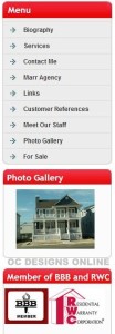
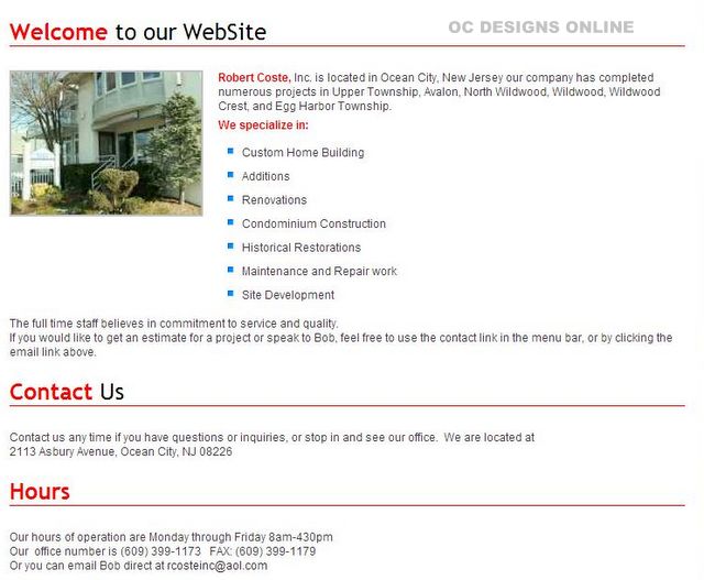
Below this photo section, the online customer sees a friendly welcome by the company. A brief message highlights the different types of projects the builder takes on. To the left is a menu that presents a variety of links the buyer has already encountered. There are additional clickable options that offer an introduction to the staff, customer references and a sales or rental agency.
With their interest piqued, shoppers now have another opportunity to look through the photo gallery. They also learn that the business holds a variety of memberships to consumer protection organizations. The landing page design now also gives a contact option that notes the office’s address and hours of operation.
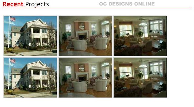
The website design scheme finishes up with a photo gallery of recent as well as completed projects. The clean design of the page, which is paired with the emphasis on photographs of actual properties, is of great value to the online visitor who wants to get a better idea of the builder’s vision before making an appointment for a consultation. Photo enlargement tools help website visitors get a good look at the detail work of various rooms and construction sites.
OC Designs Online now offers affordable website landing pages and website design we encourage you to get a free quote and start gaining the online presence you need to compete with your competitors. We also invite you to follow us on Facebook and find us on Twitter.


