OC Designs Online has designed a website for Tomorrow’s World, a New Jersey early education center. These inexpensive website designs are not only affordable but allow the owners to edit the websites themselves without paying monthly fees.
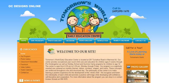
For this website design, we chose options that rely heavily on colorful representations to draw the online visitors’ interest. Shades of light and baby blue make up the backdrop that gradually fades to a creamy white toward the bottom of the page. Yellow-green brackets the midsection that consists of colors in the orange peel and apricot spectrum. The landing page design features a primary top navigation bar that continues the blue shades.
 At the top of the website, the Tomorrow’s World logo drapes around a depiction of the globe and two cartoon images of children learning their letters. To the right is an invitation to connect via phone. Right below this image is the navigation bar. Featuring easy-to-read white font, it invites online visitors to return to the home page, explore the group’s program, page through a photo or video gallery, connect via social media, sign up for a newsletter, become familiar with the yearly calendar or contact Tomorrow’s World.
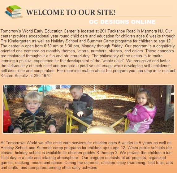
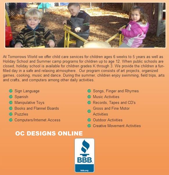
An apricot-colored middle section is framed by orange-peel-colored clickable link sections. The middle of the landing page design begins with a welcome to the website. It highlights the location and operating hours for the early education center. There is also an attractive photo featuring a few of the students who attend the program. A basic program description and information about field trips follow. Finally, there is a bullet list of activities that the children undertake on a regular basis. This section ends with the seal of a consumer protection group.
To the left, there are clickable links that repeat the options offered in the horizontal navigation bar. In addition, a news and events section highlights the happenings in the current month. To the right is an invitation for the online visitor to call and schedule a tour. A photo gallery offers further glimpses into the actual setup of the facility.
This affordable website design closes out the page with a green section that once again offers clickable link options to the same functions previously noted. There is also a repeat of the address, email and contact information. Online visitors will appreciate the visual aesthetics of the colorful site. The repetition of clickable links makes it easy to find just what the visitor is looking for. Since there is a lot of space on the site, the crisp photos give an uncluttered appearance.
If you’re looking for a website design or landing page design that doesn’t require spending monthly fees for support, we hope you’ll request a quote and find out why OC Designs Online is your #1 choice for designing the perfect website.
