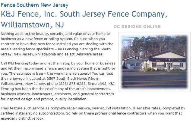
Teaming up with OC Designs Online, K&J Fencing has launched a new website. The fencing company relies heavily on photos for its site’s design. The color scheme includes shades of eggshell white, light gray, ochre and jet black. At the top of the page, the shopper sees a beautifully fenced-in pool.
Against this backdrop, the fencing company displays its logo and phone number. To the left is the company’s address. To the right, the buyer has the option of requesting a free estimate or connecting with K&J Fencing via a variety of social media outlets.
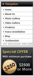
 Next, there is a collection of clickable links. Shoppers have the option of returning to the home page, viewing the photo gallery, looking at the inventory, seeing what a fence installation entails, reading the company’s blog and contacting the store’s operators. The shopper further learns that the store offers complete financing packages and staffs its phones on weekdays from 8 a.m. to 7 p.m. while on weekends there is live assistance available between 9 a.m. and 2 p.m. Shoppers learn that the company has been in business for almost two decades and does not rely on subcontractors.
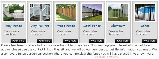
To the left of the website design, there is a navigation box that expands on the clickable links from the top of the page. The shopper has the opportunity to learn more about K&J Fence and also read some testimonials from happy customers. Right below this box, the buyer has the option of taking advantage of a $250 off special offer. To the right, the customer learns a little more about the neighborhoods that the fencing company serves. In order to help customers decide about the right type of fencing material, the company has listed six brochures for a wide range of products it carries, installs and services.
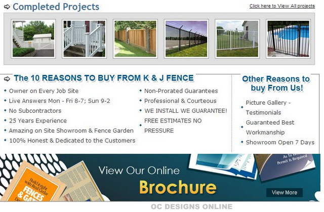
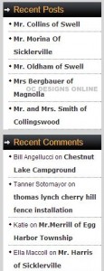
 The left margin is further taken up with recent installation news as well comments posted to these announcements. Coming back to the center of the page, the shopper notes photos of completed projects as well as a list of reasons for buying a fence from the company. At the bottom of the page, the buyer is invited to view the company’s online brochure, contact the vendor and connect via social media on Facebook. The customer is sure to appreciate the wealth of photos that accompany the specific details of each fence material and installation setup. The organized layout of the site invites the shopper to browse by installation area or fencing material, which greatly helps with the decision-making process.
OC Designs Online offers both website and landing page design and if you don’t have a logo, we can design a logo to help build your brand.
Please take a look at our amazing portfolio and it’s very easy to request a quote. We cater to our clients and understand the meaning behind customer satisfaction!
Be sure to like us on Facebook and follow us on Twitter and be sure to add us to your circles on Google+
