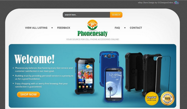
At the top of this eBay store design is a search function that allows the shopper to type in a keyword for an easy inventory listing. OC Designs Online and Phonenesaty chose to keep the colors of the site in gray, white, orange, green and blue.
 Customers notice Phonenesaty’s name and logo in the middle of the site’s upper portion. To the left, bargain hunters may click on links that display all listings as well as the store’s feedback. To the right, the options offer a frequently-asked-questions section as well as a contact feature for the buyer.
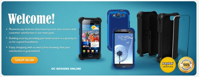
An attractive photo of cell phone accessories takes up the middle of the website. A welcome message imparts the store’s philosophy, which highlights trust, fast service and an enjoyable shopping experience. The store owner notes that the venue is PayPal certified and that satisfaction is guaranteed. A “shop now” button lets buyers quickly peruse the available catalog.
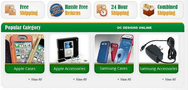
Underneath the photo there are buttons that display additional reasons for shopping with Phonenesaty. They highlight the store’s free shipping, hassle-free return, 24-hour shipping and combined shipping policies.
To the left, the customer finds a vertical list of store categories that assist in sorting the available inventory. Buyers may choose to look at Apple or Samsung products, find sale items, place bulk orders or check out hot items. Below this listing is an option to sign up for the store’s newsletter. A list of reasons to shop at this store repeats why customers may shop at Phonenesaty with ease. Finally, there is a directory of accepted payment options. Would-be buyers appreciate the convenience of this information that is so visibly displayed on the store’s website.
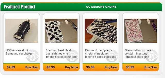
To the right, bargain hunters find four picture categories of popular catalog items. They give the shopper an idea what grouping to choose for specific accessories. Below each photo is a “view all” option that will display the inventory matching this particular type of accessory. A featured product listing showcases four photos and their descriptions and prices. The eBay store design closes out with a repetition of a centered Phonenesaty store name and logo.
OC Designs Online realizes that buyers prefer simplified listings and has chosen the bottom of the page to offer a complete inventory listing, feedback, frequently-asked-questions and contact links. Since it can get a bit confusing when shopping for cell phone accessories, the store’s designers have gone to great lengths to keep the look and feel of the page uncluttered and well-organized.
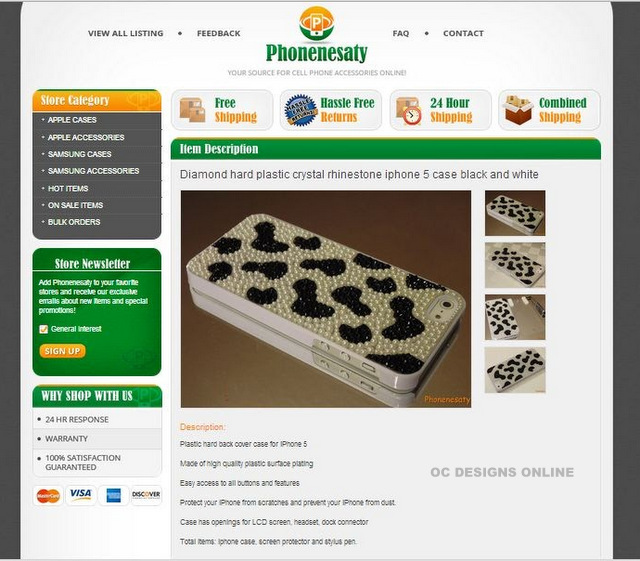
In addition to the storefront design, we also creating eBay custom listing templates. In the image below, not only is the item description easy to read and see, shoppers feel as if they are still in the same store–this is a must-do to entice shoppers to stay in your store. Ask us about custom eBay listing templates.
If you sell cell and smartphone accessories on eBay, isn’t it time you invested in a custom eBay store design? It’s easy to request a free quote and we encourage you to peruse our ever-growing portfolio.
Don’t forget to like us on Facebook and add us to your circles on Google+!


