Wild horses couldn’t drag us away from this fantastic looking site. When the Trading Co and OC Designs Online teamed up to create a custom eBay Store Design, the result was a website that’s not only beautiful but a cinch to navigate.
A fetching burgundy swath lined with a classic Celtic knot design serves as the backdrop for the tasteful logo. A search bar where customers can peruse store inventory by entering a keyword is also strategically placed in this top pane.
Directly below are two key selling points equestrians are sure not to skip over. To the right, a ‘Daily Deal’ squares off and describes the quality product being discounted. Next to the clearly listed deal price, customers can choose to view the item in more detail. The section is enclosed with a clock counting backwards to the time until the deal ends, encouraging buyers to act quickly to save big on the featured product.
The graphic of a majestic looking horse in full gear sits pleasantly next to a message indicating that everyone who is interested in doing so will save 25% on retail prices by shopping with The Trading Co.
A prominent orange ‘shop now’ link sits nicely juxtaposed against the navy blue background giving clients full authority to make the most of their online shopping.
For those who favor clear organization in their shopping experience, the large selection of saddles and accessories are laid out categorically in a number of different ways.
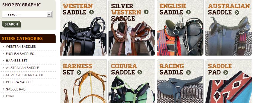
The left side bar offers customers the option to ‘shop by graphic’ by simply clicking the drop down menu and selecting the category most fitting for their needs. Directly below, these categories are listed vertically, each taking you to the full selection with the simple click of your cursor.
The most popular styles are represented in two rows of four hi-res graphics for those who are more stimulated by a visual representation of their options.
 Keeping one’s most loyal customers informed of sales and promotions couldn’t be easier with the help of a section encouraging shoppers to sign up for the company newsletter.
Visa, Mastercard, PayPal and E-Check are just a few of the ways customers can choose to pay for their purchases. All are clearly marked below the newsletter sign-up and save buyers from needing to call customer service to inquire about how to make a payment.
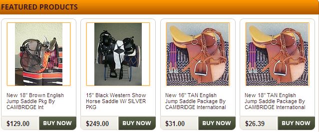
A horizontal row of four, rotating featured products are the last section of the landing page before shoppers jump into adding to their cart. A grey, ‘buy now’ button makes it easy for those ready to whip out their credit cards complete their purchases and ride off into the sunset!
At OC Designs Online, we know you can sell just about anything on eBay, but having the right eBay store design can and does make a difference in your brand getting noticed on eBay. We are delighted with this eBay store design and if you’re looking to sell on eBay or already do, browse some of our other eBay store designs to get an idea of what we can do for your ecommerce store!
Let’s be social…Be sure to find us on Facebook and Twitter, and remember that quotes at OC Designs Online are always free!


