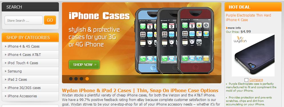
The crisp and clean Volusion store design approach that OC Designs Online used for Wydan is sure to become a favorite among shoppers. Sleek like the cases housed within, this online retailer’s grey and black color scheme uses sparring orange highlights to accentuate colorful product offerings.
At the top of the page, the shopper is greeted with the Wydan logo and the main navigation panel with options to peruse their account, view their carts, or contact the vendor.
As an additional gesture of superb customer service the phone number is also cast in orange to help ward off any potential issues.
Below this selection of options, is a welcome panel where buyers can elect to read on and learn more about the advantages of shopping at Wydan Tech. To the left of this screen section, the store designer utilized the pops of orange to set apart several store categories underscoring various cell phone types.
Of course, shoppers can elect to forego this option by taking advantage of the custom search bar just above.
Scanning into the right sidebar, a rotating daily deal sits prominently beckoning shoppers to take advantage of the day’s discounted merchandise.
Just below are a list of top sellers, the brands they’re designed to cover and price.
The left sidebar takes a different approach, boasting the site’s shipping policies, including free delivery on orders over $20 and an enticing sales promotion for 30% off $15 or more.
Shoppers will appreciate the easy-to-navigate Volusion store design of Wydan’s central website section.
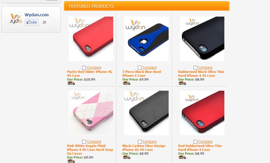
In the midsection, a 3 X 5 panel of featured products makes it easy to quickly glance at numerous cover models that may be a stylish match.
As an added branding element, the section also includes a small plug in where customers have the option to “like” Wydans on Facebook.
To wrap the storefront, we’ve created a custom footer which repeats the grey color scheme, drawing attention to various parts using orange accents.
A short welcome message appears, conserving space in the main section of the storefront. Alongside the mini sitemap, extensions to connect via social sit to the left, while the logo in the bottom rights acts to counterbalance the final section.
Want your Volusion storefront to stand out? Browse our ever-growing portfolio of custom store designs and like us on Facebook, follow us on Twitter and check out our Pinterest Boards!
Why not get your free quote today and start selling even more on eBay!


