What’s more comforting at the end of a long day than wrapping yourself in the comfort of great linens? Duvet covers can completely change the look and feel of your most intimate spaces. Why not spruce up your space with something fresh and fun – mustaches or anchors – while also enjoying the feeling of being wrapped under warmth. When Amadora came to us at OCDesignsonline, we had our tools ready to help them with their custom eBay storefront design.
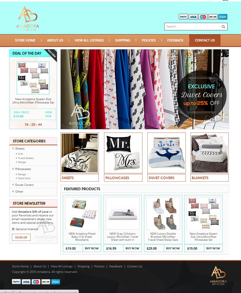
We started, as we always do, by learning more about our client’s products and needs. From Amadora’s logo, we took the colors of gold and used them throughout the site. We used robin’s egg blue to give a good contrast to the gold, making an elegant statement. We wanted to carry the theme through the entire page.
We created a custom header that looks great!
The gold menu bar on the blue background provides a nice “welcome” to our client’s customers when they visit the site. We included menu items for each of the topics a prospective buyer might want answers for when visiting the site. Immediately under the menu bar, we created a spot for the “deal of the day.” This is a place for the client to feature a product for a great price. We included a ticker under it so that the customers at the site can be further persuaded to “buy now” instead of waiting for a later date.
We wanted customers to know, at a glance, what Amadora sells
When customers arrive on site and view the header image, it’s easy to tell that Amadora deals in linens. We wanted to show the variety of fabric choices offered by our client. In a circle, we have the sales pitch: Exclusive duvet covers 25% off. It will be very easy for customers to realize that they are in the perfect place for purchasing quality bed linens at a reasonable price within moments of arriving at the page.
Categories help customers navigate this custom eBay page
We wanted customers to be able to find what they are looking for easily, whether that’s sheets, exclusive duvets, pillowcases, or blankets. Thus, we created image buttons for customers to click on when they visit the site. Customers know, without reading the category heading, what they will find if they click on each image. We further divvied up categories in the left sidebar. This way, customers can browse the site in a format they are used to.
Featured products to “buy now.”
The final touch we added for our client was the featured products bar. This way, Amadora can display highlighted products. It’s good for businesses to feature a few products on their storefront page. This way, customers don’t have to browse or search to have something catch their eye. We’ve increased page views and sales for Amadora by redesigning their eBay page to look more streamlined and professional.
Let us cover your needs!
If you’ve been thinking your site needs a revamp, we can help. We have many different eBay listing templates to choose from on our site. When you find something you like after browsing our portfolio, don’t hesitate to request a free quote. You can follow our design success stories on Facebook, Twitter and our Google+ Page!


