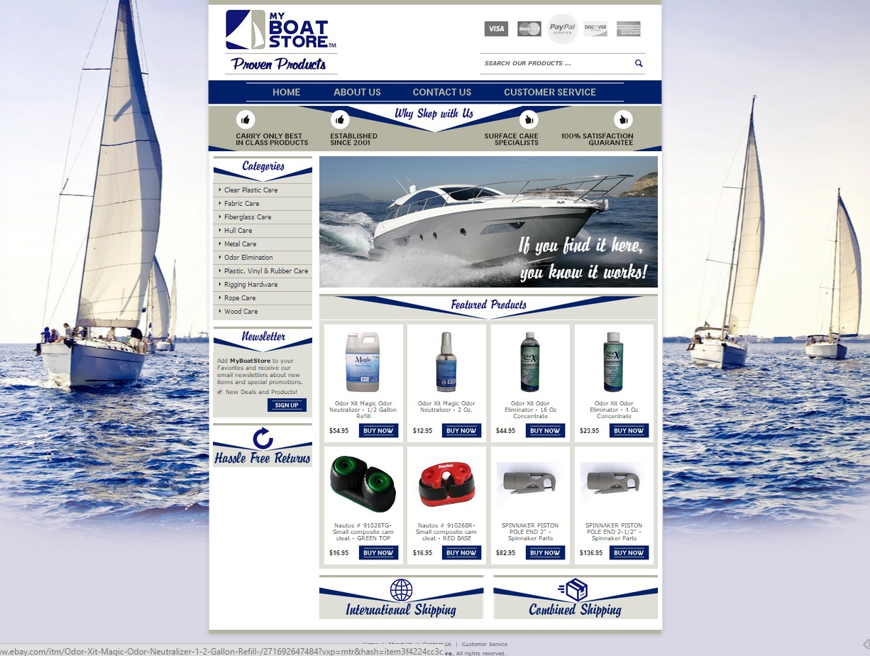
Maintaining a boat can be an activity of comfort and one involving hard work. To take care of a boat’s hull, maintain the ropes, and ensure the fabric is in good repair, the proper tools must be obtained. My Boat Store offers customers great products for maintaining their boats for great prices. When they approached us at OCDesignsonline to help with their custom eBay store, we were happy to oblige.
We started off the site with background images containing sailboats. The store’s logo has a sailboat in it, and we wanted to stick with the nautical theme. We used navy blue, khaki, and white as the predominate colors throughout the site to have the site hang together aesthetically. We know that our client will have smooth sailing ahead.
We preserve the time customers are on-site
The header of the site greets customers with the image of a motorboat racing through the water. At the very top of the header, we have the company logo, a search box, and the accepted forms of payment. We followed that with a crisp navy and khaki menu bar, where customers can easily navigate to find the information they need regarding shopping at this custom eBay store. Next, we listed the store’s unique selling points so that customers would at-a-glance know what makes this store unique over others.
We kept categories in the sidebar on this custom eBay storefront
We knew that there would be a lot of categories for customers’ nautical needs, so we kept them in the sidebar to create a more streamlined appearance. This way, it’s easy for customers to find what they are looking for without having the custom eBay page feel overwhelming or cluttered. Sometimes, it really is the case that simplest is best.
Featured products take center stage
Because we kept the store’s categories to the sidebar, we could create premium space in which our client could feature various products carried in the store. Products can include what’s on special for the day, items new to the shop, or items that will be of particular interest to My Boat Store’s target customer. By having a defined space for featured products, it’s easy for customers to make quick purchases by clicking on the “Buy It Now” bar, turning page visits into sales.
Footers make the difference
We didn’t want any part of our client’s site to go to waste, so we made sure to include information about shipping options, the store’s returns policies, and a newsletter subscription box at the base of the custom page we created.
For smoother sailing with your ecommerce efforts, contact us for a quote
At OCDesignsonline, we have a wide variety of listing templates from which to choose on our site. No matter what kinds of products you sell, we’re certain you’ll see somethign you like when you browse our portfolio. Be sure to request a free quote when you find that site that inspires you. For more great custom eBay storefront ideas, please “like” us on Facebook, follow us on Twitter and check out our Google+ Page!


