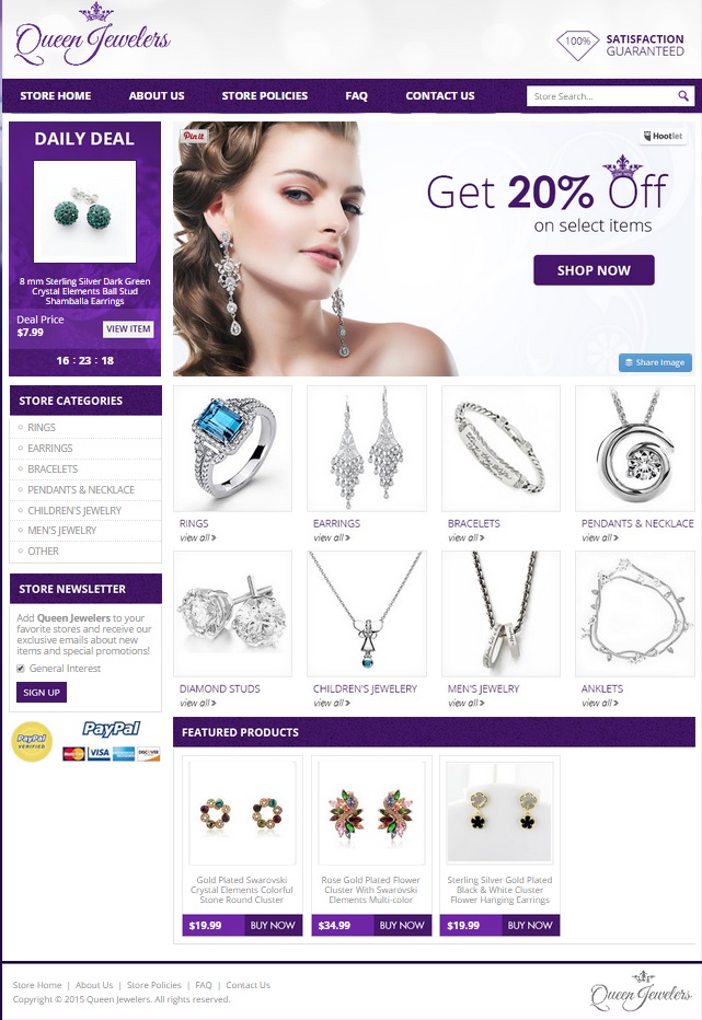
Baubles, glitz, glamour, bling, icing – whatever you call it, diamonds are a girl’s best friend! What woman doesn’t love to adorn herself with shiny gemstones? When Queen Jewelers approached us at OCDesignsonline for help, we were more than happy to oblige. We wanted to jump in there and give them a custom eBay store that would be as regal as the products they sell.
We started by working from the logo, which contains a crown motif and purple font. We carried the purple theme and crown motif throughout the entire site, using the motif in the “O” of “Off” to tie things together. We used a mostly white background, because we figured our client’s products would sell best if allowed to have the spotlight. Why complicate things by having a competing design or color in the background? This resulted in a crisp and clean look that pleases the eye.
Sometimes what’s simple really is what’s most elegant
Think of the crisp beauty of a diamond. It’s a simple colorless gemstone, which radiates beauty wherever it appears. Because the glamour of a diamond necklace speaks for itself, the last thing we wanted to do was to clutter the page with “stuff.” That’s why we used different tones of the same purple hue throughout the site. In the header, just the logo and the satisfaction guarantee appear against a white background. The menu bar is purple with a white font, allowing customers to have their questions about the shop answered – and we included a small search bar at the end of the menu for those looking for a specific item. The banner image is of a woman with beautiful, flawless skin wearing dangle earrings. All of these elements work together to create an upscale feeling fit for royalty.
Tempting customers with a daily deal in this custom eBay store
We created two areas where customers could be tempted into purchasing items in the spur of the moment. The “Daily Deal” box is a place with a countdown timer where Queen Jewelers can feature one item for a limited time at a great discount to the customer. We also created a “featured products” bar where our client can post additional items of interest to their customers. Features like this help generate repeat customers who come to check out what sales you have that are current.
We keep categories clean with single, beautiful images of jewelry
Why clutter up an otherwise streamlined page? We used images of single pieces to signify each of the categories of product in our customer’s store. By keeping categories visual, it helps customers to find what they want, and it helps entice customers to keep browsing the store to see what else might be available. We also listed categories in the sidebar so they’d be available from our client’s category search pages.
Contact us for help with making your custom ebay jewelry store as beautiful as its products
At OCDesignsonline, we have a wide array of eBay listing templates to suit every store type from jewelers to toy sellers. Browse our portfolio, and when something catches your eye, request a free quote. Be sure you follow us on social media for updates and more ideas for your custom eBay store. We’re on Facebook, Twitter and Google+ too!


