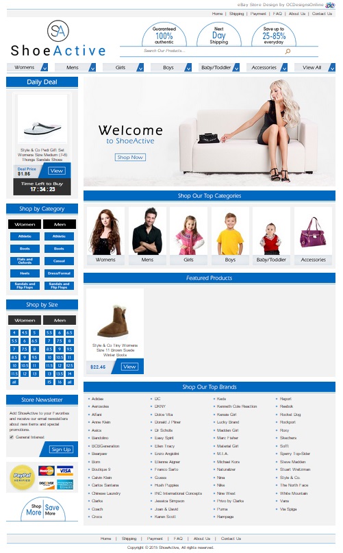
What goes on your feet can make or break an outfit. Whether you’re putting some high heels, flip flops, gladiator sandals, or peep-toes on your feet, it’s important to make sure your shoes top off your outfit – not destroy it. Shoe Active, a recent client of ours, came to us for help creating a new eBay shoe store design. At OCDesignsonline, we are dedicated to ensuring that our clients are completely satisfied with our work. That’s why we took special care in helping this particular client find a way to put their best foot forward.
We started work on the site by using the store’s products and logo as our inspiration. We pulled the colors for the site from the logo and carried them throughout the whole site. It was important to us that the site’s color scheme and graphics served the same function that a well-chosen pair of shoes do for an outfit: They pull thet whole ensemble together so that it all looks intentionally put together.
From header to footer, we’re proud of the design for this eBay shoe store
We lead the site off with the logo, and we stacked the store’s unique selling points on top of the search bar – making it easy for customers to see what sets this eBay shoe store apart from others, and making it easy for customers to find specific items they might be searching for. At the very top, we have a menu so that customers can browse our client’s policies, and understand how auctions on this site work. The main menu over the header image allows customers to browse types of shoes and select different advanced filters to bring up the types of shoes that they are looking for. The header image has a chic woman in a black dress wearing t-strap pumps while she sits on the couch, highlighting the fashion-forward nature of the site.
Custom category pages and listing templates feature branding to keep the store’s branding consistent
Once a customer clicks on one of the image buttons for a category, it takes the customer to a special custom category search page. On this page, the branding is the same as on the main page. Customers can navigate to other places in the site by using the sidebar or top menus. When a customer clicks on a desired product, then the listing template is also branded. Customers can find full descriptions of the products they are considering as well as information about our client’s store policies.
Daily deals and featured items keep customers coming back to see what’s new
We also created a section for daily deals and featured items because these sorts of sections keep customers coming back to see what’s new in the store. By changing out these areas on a regular basis, our client can demonstrate what’s new, on sale, or of particular interest to their target market. It helps to increase their bottom line.
Increase your bottom line by hiring OCDesignsonline to create a custom eBay page for your business
When you want to increase your sales, turn to OCDesignsonline. We have a wide array of eBay listing templates from which to choose on our site. Browse our portfolio, and when you see something you like, request a free quote. Follow us on your favorite social media website. We’re on Facebook, Twitter and Google+!


