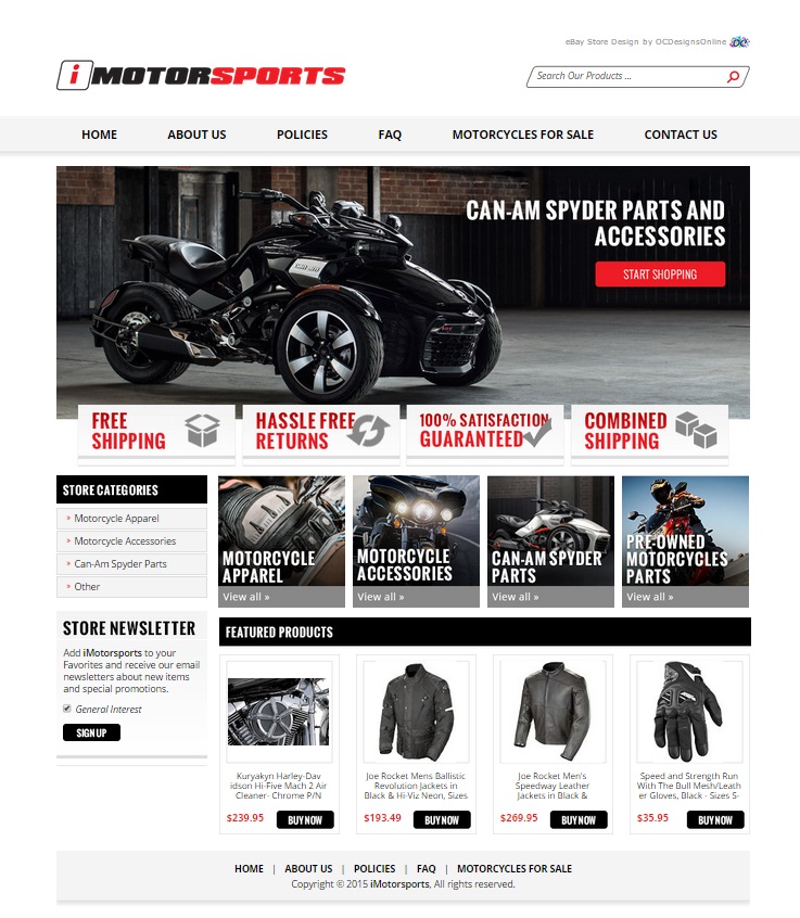
Life is fast, but there’s always something faster. Motorcycles give their riders an air of mystery and danger. When iMotorsports approached OCDesignsonline about helping to design a new eBay shop so that they could better sell parts and accessories for motorcycles, we were happy to jump in and get our hands dirty. We’re happy with how everything turned out for their site.
We wanted to convey a sense of adventure throughout the entire site we created for our clients, but we also wanted to keep things simple. We took the same clean lines in the company logo and applied them throughout the site – keeping the graphics simple and crisp. We knew the best way to sell the products offered by our client would be to let the products speak for themselves.
Sometimes, being square is a good thing
And other times, a rhombus is a better shape. We took the same diagonal shape that is in the logo for iMotorsports and used it for the search bar, creating a nice line of symmetry for the customer’s eye to follow. Outside of that, we stuck to hard rectangles and squares for the rest of our eBay shop design. We used block letters for the font, a motorcycle in the header image, and crisp rectangles with the same font color as the logo for the unique selling points. The result is a site that appears clean and well put together.
We kept categories simple on this one
We figured that customers looking for a specific part would use the search bar for that part. So, instead of creating detailed categories, we made the categories browseable – and kept it to four. This means that riders and customers alike can easily browse all the parts and accessories and apparel they want – and find everything in neat categories. For the sake of browsing, we also included a simple category list in the sidebar.
We also kept featured items simple
Instead of including a deal of the day box in the sidebar, as we’ve done for some of our clients, we wanted to keep things simple. So, we kept featured items at the bottom, so that a customer can view the entire eBay store design at once. This increases the interest in products that are new, on sale, or of particular interest to customers. By switching featured items out, our client can keep customers coming back for more.
Let OCDesignsonline help rev your eBay store design’s motor
At OCDesignsonline, you’ll find that we have a large selection of eBay listing templates from which to choose. You’re sure to find many ideas when you browse our portfolio, and when you see something that catches your interest, request a free quote. For more great eBay shop design ideas, check us out on Facebook, Twitter and Google+!


