When you want to appeal to the largest audience possible, it’s best to show up in multiple places. Sometimes, though, you don’t want your customers to become confused. Our client, Right Foot Shoes, for example, wanted to create an eBay store and ecommerce website at the same time. They wanted the pages to be similar, but not identical, including in the name. Thus, we created an eBay storefront for their brand, A Step Ahead Footwear. By diversifying in this way, they help to ensure that they can market and appeal to their target market for each platform.
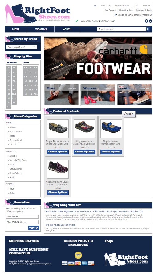
The ecommerce site for Right Foot Shoes
We started by using Right Foot Shoes’ logo at the top of the page. We then built the page with ease of browsing at the top of our minds. We created filters and a search bar on the site. We also included brand search, size search, and store categories to make it easy for customers to find those products for which they search. Ease of use is one way to build a solid customer base. A second means of building a rapport with customers and encouraging repeat visits is by having featured items on site. By adding featured items to an ecommerce site, you encourage customers to come back to see what’s new, popular, on sale, and of particular interest. This kind of repeat viewing will increase your bottom line and help boost your sales long-term.
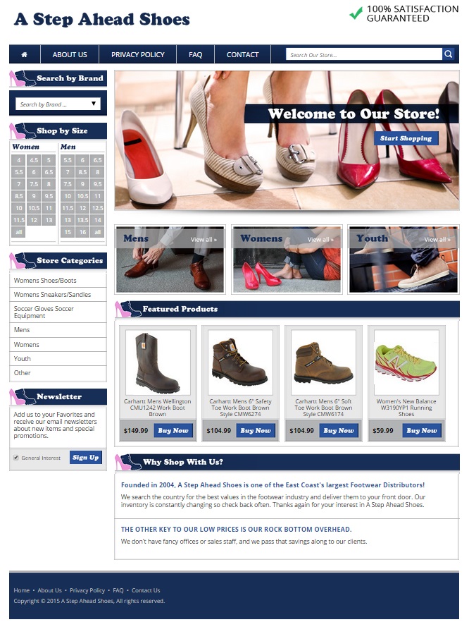
An eBay storefront for A Step Ahead Shoes
We took the logo icon of the shoes from Right Foot Shoes and used it in the headings on the eBay storefront sidebar. We also used the same colors for A Step Ahead Shoes as we did for Right Foot Shoes. This gives continuity to the sister sites without having the two sites appear to be identical. We wanted the header to be eye-catching, and so we included an image of feet in fashionable shoes with other pairs lined up. We made sure to include a brand search in the sidebar as well as a size and type search. This way customers can browse or search for a particular pair of shoes carried by our client. Finally, we created a featured products area so that our client could use the same strategy on the eBay storefront as is used on the ecommerce site – bringing repeat visitors to see what’s new, of particular interest, on sale, or popular. By making sure the two stores feature different products, it helps to increase the bottom line as a whole.
Contact OCDesignsonline today to get a free quote on our eBay store and ecommerce website design packages
We even offer a $400 discount when we create both an eBay store and ecommerce website for your brand. At OCDesignsonline, we have a wide range of eBay listing templates from which to choose. Please take a moment to browse our portfolio and request a free quote. Also, don’t forget to find us on Facebook, Twitter, and Google+!


