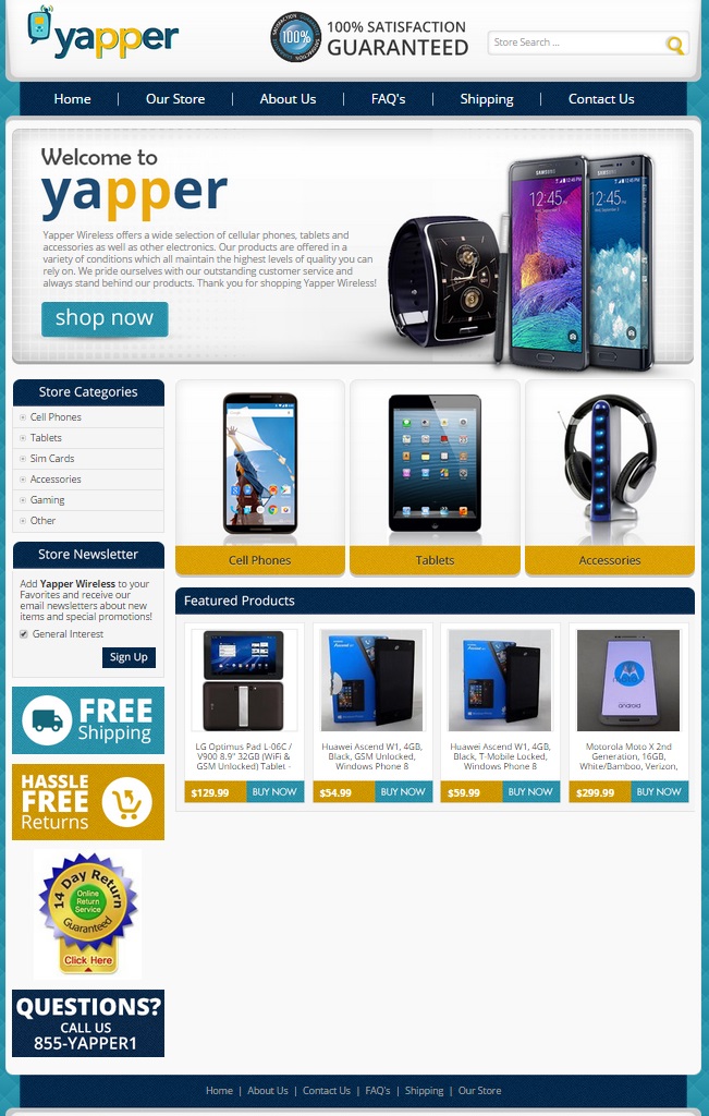
Most people, these days, have a smartphone. However, getting a smartphone that suits your needs can sometimes be dicey work in itself. After all, many cell phone companies want you to agree to a certain contract length to make that prized phone more affordable. When our client, Yapper, approached us and asked if OCDesignsonline could help them boost their sales, we were happy to say, “Yes! Let us create an eBay cell phone store design that works for you and your products!”
Yapper’s logo has a lot of energy in it. The yellow and blue coordinate well together. We took those colors and worked them throughout the site – yellow for the magnifying glass in the search bar, as the buttons for the category pages, to highlight unique selling points and teal for the “shop now” and “buy now” buttons. Overall, the store looks great!
The header makes an eBay store’s first impression
It’s important to make the header of any site stand out. For Yapper, we kept the header fun and playful. The store logo, a satisfaction guarantee, and a search bar kick off this custom ebay cell phone store design. We then created a menu so that customers can learn more about the store from which they are purchasing products. This is where customers can learn more about payment terms, return policies, and shipping information. Next, we created a mostly text header image. Sure, there are images of cell phones and a watch, but we also left a lot of negative space to help text about the types of products carried by Yapper stand out from the background.
Clearly defined categories help customers find what they’re looking for
One of the most important things about an eBay store is that a store has made it easy for customers to find the items for which they search. We took time to ensure that customers could do just this. We created image buttons for the three main categories of products carried by our client, and then we listed the rest of the categories in the sidebar. Between these navigational tools and the store’s search bar, customers should be able to locate those items for which they search quickly.
Featured products keep customers coming back to see what’s new
When stores regularly change out the products they feature, it helps to encourage customers to come back. Featured products areas give the clients we serve an opportunity to show customers what’s new, on sale, or of particular interest in their store. When these products are switched out at a regular interval, it helps to encourage both impulse purchasing habits and repeat business – boosting a store’s bottom line.
Contact OCDesignsonline for help with your eBay store design
When you’re browsing our website, you will notice that at OCDesignsonline, we have a wide array of eBay listing templates. Please take your time browsing our portfolio. When you’re ready, request a free quote. You can also find us on Facebook, Twitter, and Google+ for more ideas!


