We’re really pleased with the outcome of one of our latest eBay store designs. At OCDesignsonline, we were approached by our client, SGI Fashion Outlet to help create an eBay store design that would really wow customers and help to boost their sales. When we create stores for our clients, we ensure that not only is the custom design we create unique, but also that it looks professional. We want customers to feel that they are browsing an ecommerce site while experiencing the convenience offered by an eBay store.
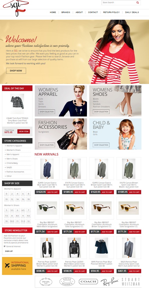
We started our design by using SGI Fashion Outlet’s store logo and pulling the colors from there. Because our client is a fashion wholesaler, we wanted to be sure that the store’s site looked great. We used red in the headings, but we also found a product that incorporated the same red for the store’s header image. This makes the whole eBay store design pull together and look intentional – communicating to customers that our client really knows what they are doing when it comes to fashion and style.
Creating a fashionable site from top to bottom
We wanted the entire site we created for our client to look amazing. Thus, we went for visual appeal. In addition to creating a striking banner, we wanted all the components of the eBay store design to be visually attractive. Thus, we used modeled images of products for the category buttons, and we created a space for “new arrivals” where customers can browse the newest arrivals to the store. All of this works together to help draw in customers and to keep customers browsing while they are visiting our client’s site.
We wanted the eBay store design to be easy to navigate
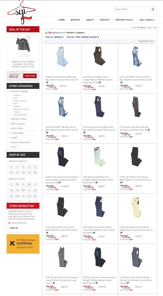
It wasn’t enough to create a site that looks great. It was also important to us that our client’s site was easy for customers to navigate and browse. Thus, we created custom category search pages that carry our client’s branding throughout the entire site. This makes it easy for customers to continue to browse by using the site’s sidebar. Not only does it mean that the eBay store design looks like an independent store, but it also allows customers to browse as they would in an independent ecommerce site.
Custom listing pages help create brand awareness
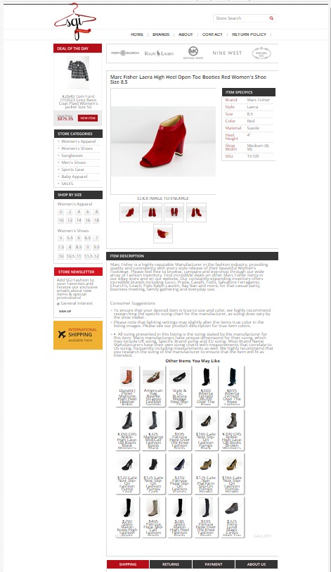
We also created custom listing pages for our client so that it would make it easy to browse the site if a customer lands on the listing page. From the listing page, a customer can then browse more of our client’s products. By doing this, not only does it make the whole eBay store design more mobile friendly, but it also helps our client to sell more products due to product discovery.
Contact OCDesignsonline today for a free quote on your custom eBay store design needs!
We have a large selection eBay listing templates from which you may choose at OCDesignsonline. Please be sure to browse our portfolio and request a free quote. Also, don’t forget to find us on Facebook, follow us on Twitter and check out our Google+ Page too!


