For the eBay seller Kid’s Tower, a new design was just what they needed to jumpstart sales. As we do several times a week on this design blog, we at OCDesignsonline are going to share with you some insight into the design process for this recent client.
Kid’s Tower sells clothing for babies, toddlers, and young children. They host a variety of brands and even some special seasonal items for this end of summer rainy weather.
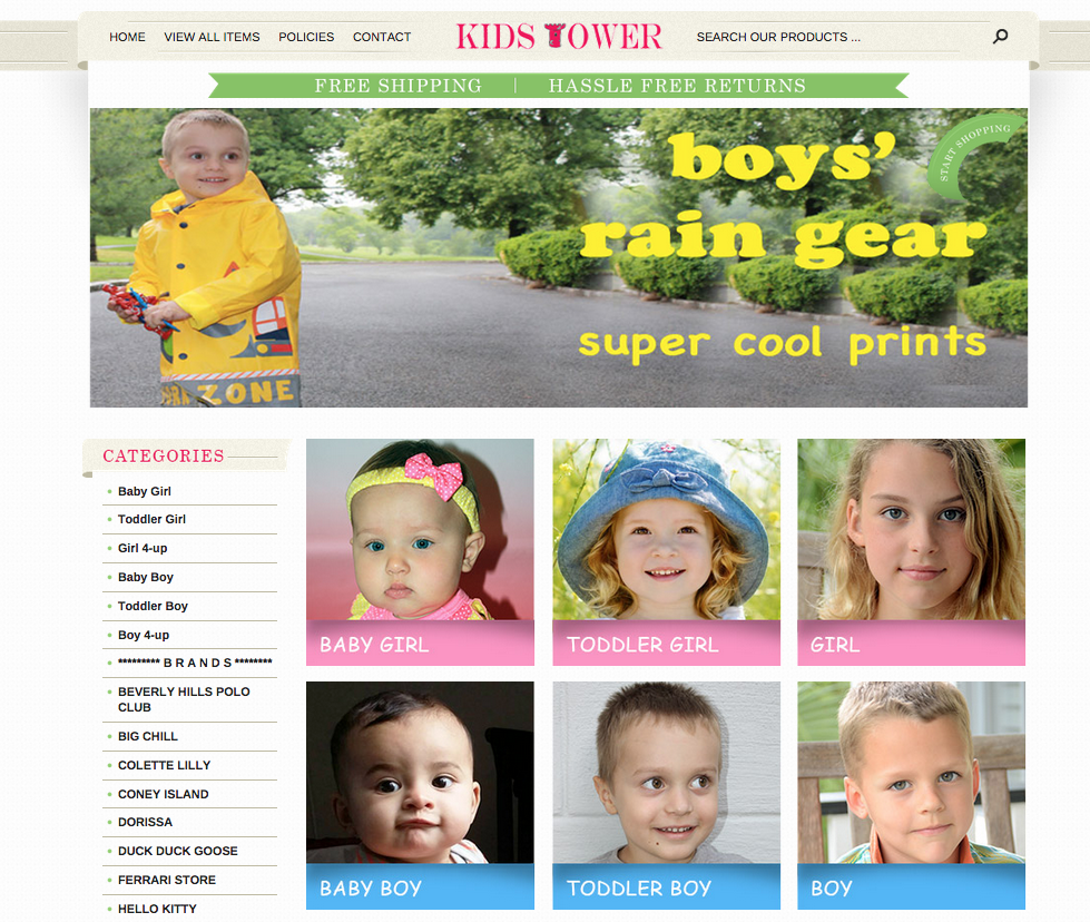
Picture categories help parents decide where to start shopping
Since there can be some varying opinions on the ages ranges from baby, toddler, to child we have helped customers avoid the headache by showing examples of children in these age ranges in the middle of this design. This way, parents aren’t looking for clothing for their four year old in the toddler range.
Browsing with a purpose is important for converting customers, we don’t want a parent finding a print and style they love to only then find out that the size range won’t fit the age of their child.
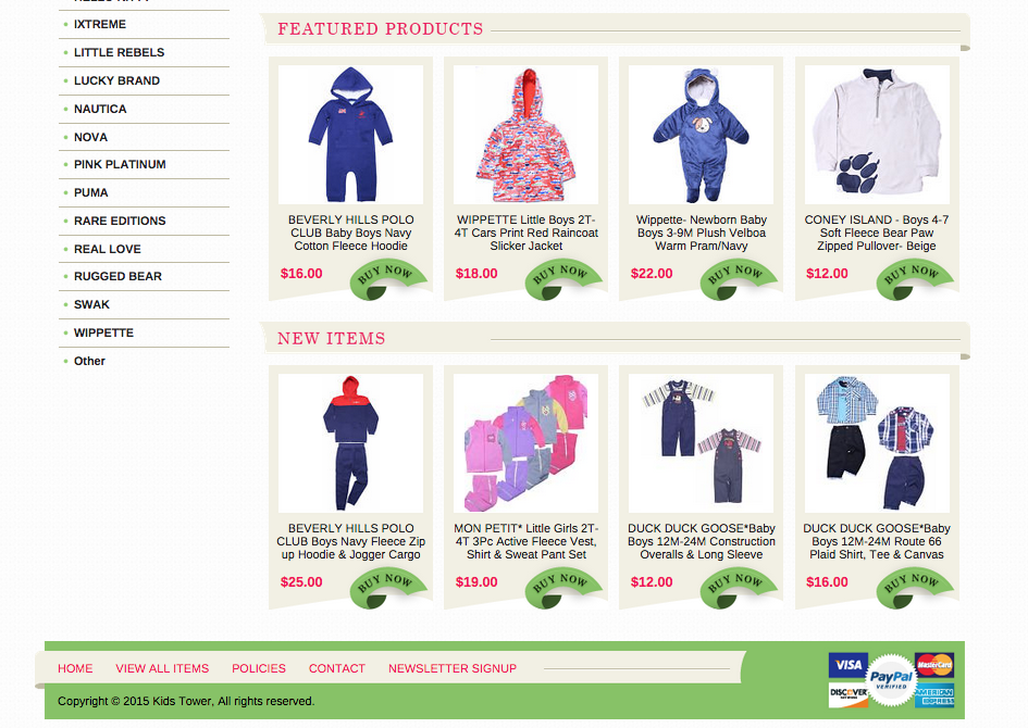
Featured products and new items section increase sales
Having both a featured products and a new items section works towards our clients advantage. In the featured section Kid’s Tower chose to add rainy weather items — which is perfect for this season because now parents browsing this store are much more likely to buy these items when they see them, when they may not have otherwise searched through the store for rain-appropriate attire.
The new items section also shows what is currently in style or high performing items that needed to be restocked so it is another valuable impulse buy section that can help potential customers browse and add more to their cart.
The welcome image encourages seasonal purchases
As well as the above mentioned sections, the welcome image was also strategically placed to be a friendly and fun image to encourage shoppers to buy seasonal items before they are no longer necessary.
Above the welcome image we have also created a free shipping and hassle free returns banner to show some of the value our client can bring to potential customers.
Contact us to get a free quote on your new eBay storefront or eCommerce design
OCDesignsonline has a wide array of eBay listing templates to choose from on the site. Take a moment to browse our portfolio and request a free quote. Also, don’t forget to find us on Facebook, follow us on Twitter and check out our Google+ Page too!


