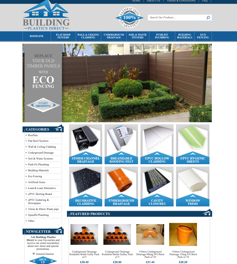
The great things about eBay is all of the great stores out there with DIY supplies for the advantages go-getter out there. It’s wonderful to have a place where people can find all of the items they need for projects at a great price. Today, the OCDesignsonline team is sharing with you a few details on the eBay storefront design we’ve created for Building Plastics Direct.
This angular design helps draw the eye
For our client, they sell supplies for all kinds of home and garden DIY projects, so we used a few angular roof logo to draw attention and then we drew in those same angles into the clickable category areas and in the side headers. These angles help move the eye around the page, which helps products sell more and get more exposure than they normally would have with standard website templates.

The Featured Products widget also helps products sell more because it shows some of the building supplies available from our client at a glance, which can patrons to impulse buy some items while also showing them that this store is worth exploring. The Buy Now subtle call to actions also works in our clients favor.
This dark blue, light blue, grey, and green design helps show customers what they can expect from our client at a glance, helps them sell more, and sets a professional vibe that customers can trust.
If you want a store design that suits your store perfectly, you need to contact our team for a free quote.
Request a free quote now to get started
OCDesignsonline has a wide array of eBay listing templates to choose from on the site. Take a moment to browse our portfolio and request a free quote. Also, don’t forget to find us on Facebook, follow us on Twitter and check out our Google+ Page too!

