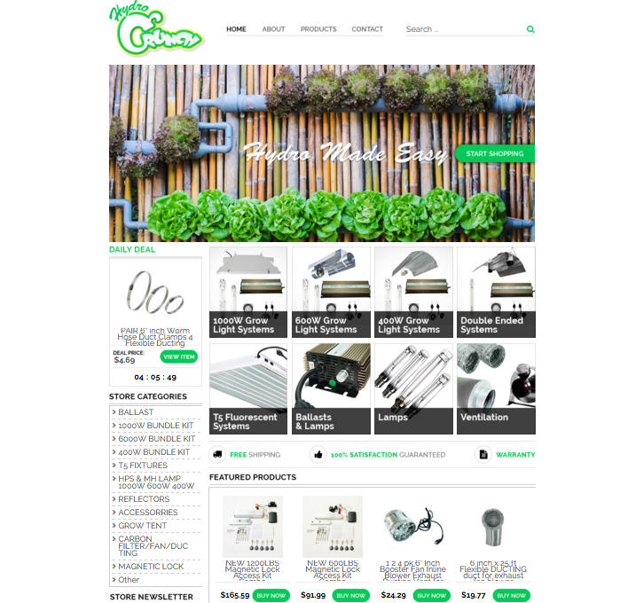
One of our most recent clients, Hydro Crunch, is now the proud owner of a new eBay storefront design that helps them sell more and impress customers. Here the OCDesignsonline team is going to share a few of the reasons why this design helps our customer perform.
This white space design brings attention to the products
In our 2016 eCommerce trends to watch post, we shared how white space is more important than ever in the growing digital space. Negative space between different design elements helps products more acutely stand out, bringing the attention on the products and not just on the professional design. This definitely holds true for the design we created for Hydro Crunch.

Now that the attention is on Hydro Crunch and their products, not on a flashy website design, let’s talk about the strategic use of color. Since our client sells parts for hydration systems, products that help plants grow, it seemed pertinent that we use green instead of blue. Sure this is a hydration system, so many designers would use blue, but we thought the liveliness of green (life that you can create with a hydration system purchased from our client) would connote more of what our client is selling. Plus, it matches the stellar welcome image we put together for our client.
Daily Deals and Featured Products help products stand out
In this well thought out eBay design, we also created a Daily Deals and Featured Products section so that customers considering creating their own hydration stations will have some products to consider and compare with at a glance. Products featured in these sections always sell more.
The only way we could have made this design even better would have been if our client had included a custom eBay listing template in their design package. eBay templates that match the storefront help customer’s see more of a continuous brand image while also being more encouraging to those that find our clients through eBay search.
If you want to get your eBay store to it’s best-performing self in 2016, you need to get started working with our team. We know how to make products stand in the best light.
Request a free quote now to get started
OCDesignsonline has a wide array of eBay listing templates to choose from on the site. Take a moment to browse our portfolio and request a free quote. Also, don’t forget to find us on Facebook, follow us on Twitter and check out our Google+ Page too!

