OCDesignsonline has worked with dozens of jewelry stores, and we feel like our designs get better and better. The more experience a company has, and we have many years of experience, the easier it is to see where things can be improved and what works best in the long-run.
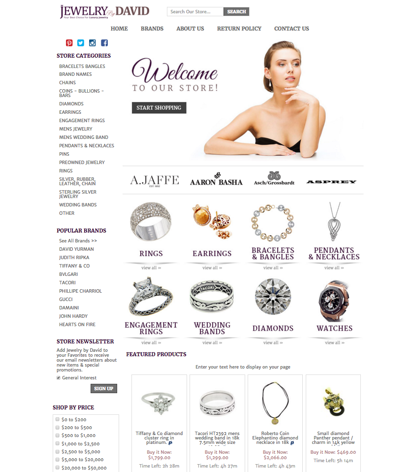
The design we are sharing with you today is for our most recent jewelry client, Jewelry by David, and it is the perfect example of an effective eBay storefront design that helps a store sell more.
This design is organized for optimum benefit
We love utilizing traditional text linked categories, as well as visual clickable category images for an important reason. Using both improves SEO for our clients and it helps customers grab onto more details and quickly find what they are looking for. Potential customers can gain what they need to know in only a moment while deeper looks tell them more information.

Our team has also created multiple ways to shop for our client’s customers, letting them search by brand, type of product, and even price range – so customers always get what they want for themselves and for their loved ones.
The white space helps products stand out and sell more
We’ve spoken about the importance of white space, AKA negative space, in designs often (listing it as an important 2016 eCommerce trend) because it brings attention right where it should be, on the products themselves. It helps these jewelry items stand out. Many designers think that the design should stand out the most, but really – it should emphasize everything else.
If you want your store to bring attention where it should, on the products you are trying to sell, then you need to contact our team for a free quote right away.
Other jewelry stores we have helped stand out:
Request a free quote now to get started
OCDesignsonline has a wide array of eBay listing templates to choose from on the site. Take a moment to browse our portfolio and request a free quote. Also, don’t forget to find us on Facebook, follow us on Twitter and check out our Google+ Page too!

