BigCommerce is billed as the best eCommerce platform for growing your sales. It’s seen as an asset in eCommerce with its annual growth and inexpensive cost. It’s no wonder that people are flocking to this platform to launch their store.
But from there, what do you do? You’ve joined the likes of Martha Stewart, Ubisoft, and Toyota by joining BigCommerce. But how can you get your brand to stand out? That’s where OCDesignsonline comes in. We create beautiful on-brand BigCommerce store designs for our clients and we are seeing them succeed in their sales goals day in and day out.
Check out the 5 best BigCommerce template designs from our team below:
1. Fin-atics’ BigCommerce Store Design
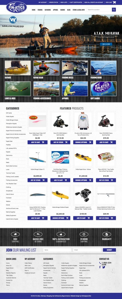
Fin-atics sells fishing gear and they sell it well! The site features dark blues and greys to elicit a homey and welcoming feel (while also reminding you of fishing on a cloudy day), and uses a wood backdrop to simulate the deck you may be using this equipment on. The welcome image slideshow features some of the products they sell and some calls to action to encourage shopping. All the important information shoppers will need is readily displayed, while the rest of the store is cleanly organized so that users can find exactly what they want. Everything is perfectly themed together to bring about the feelings we want our client’s customers to connote with this brand.
2. BoatstoreUSA’s BigCommerce Template Design
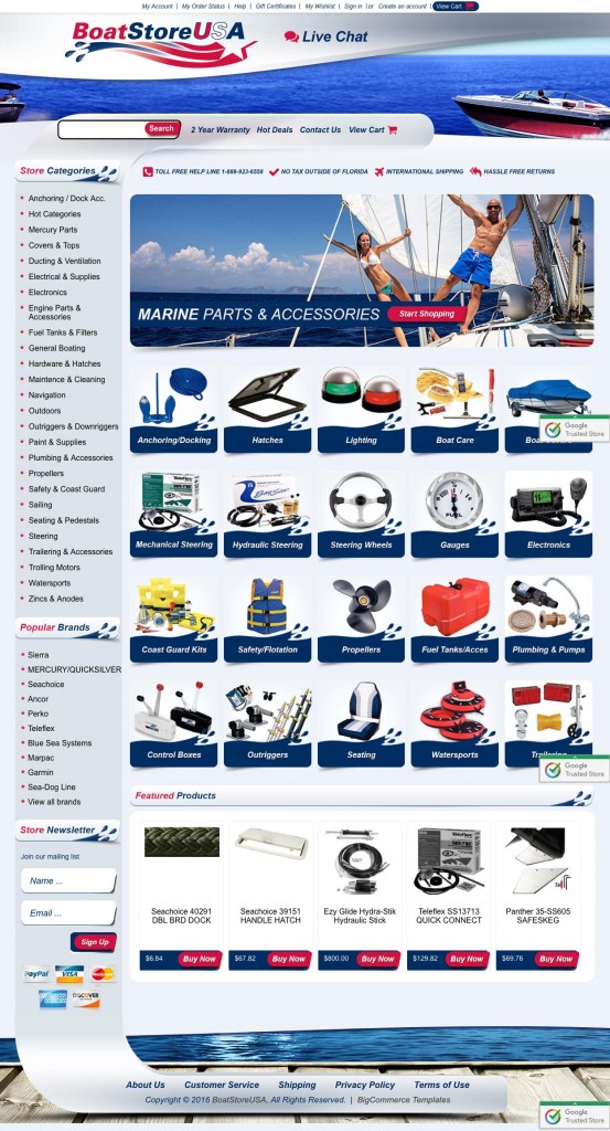
BoatstoreUSA features a fun and exciting design that is on-brand for the boat products they sell. The curvey imagery and water theme makes one feel as if this storefront is a boat itself, which works well for creating store associations, while also helping users move their eye more across the storefront. The key information on the site (live chat, contact us, etc.) are located right at the top of the storefront, which is really valuable for NAP search results and for building brand credibility, and all of the categories of items for sale are neatly located on the side of the site to encourage browsing. The Featured Products area is also a hot widget in this design as it helps the store bring attention to some of their best products and general pricing.
3. RC World’s Impressive BigCommerce Design
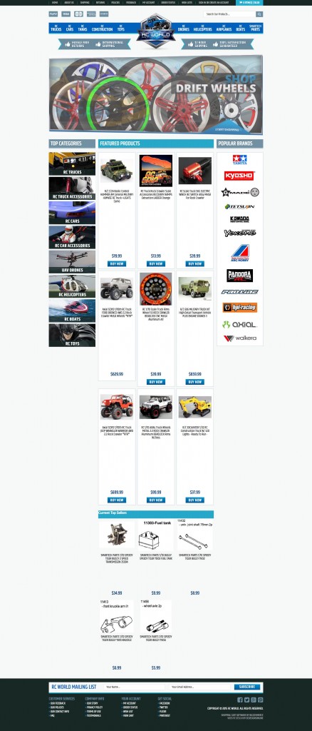
RC World is a colorful organized design for the RC car enthusiasts. While the colors are subtle, the white background (we love using negative space in our designs) really allows the colors to pop out from the storefront and maintain an organized presentation. The various RC categories are located at the top of the page, for the ease of access, but are also featured on the side of the storefront for the categories that are most popular. We made sure to utilize a scrolling website welcome slideshow, a Popular Brands section, and other clickable areas to encourage users to shop around and find exactly what they are looking for.
4. BC Profile’s On-Brand Custom BigCommerce Store Design
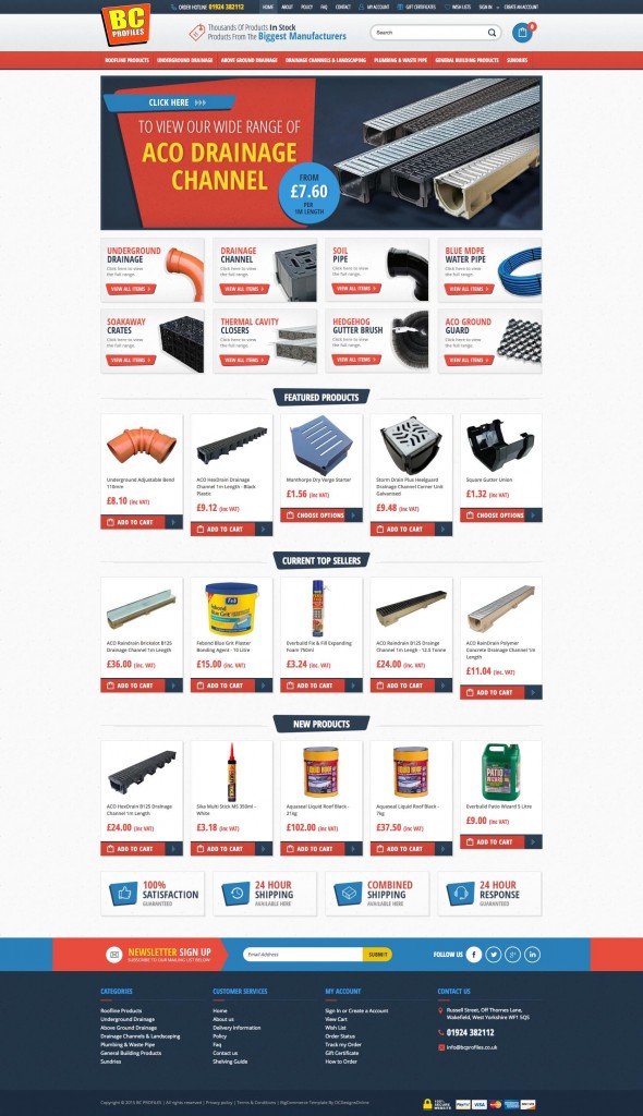
BC Profile UK BigCommerce site has a retro, yet modern feel to it. The design packs so much information, while still not overly complicating the integrity of the storefront’s design due to the information’s strategic placement. The color scheme has a very pop feel to it with it’s muted red and blue colors, while the various sections (like the Featured Products, Top Sellers, and more) all show different aspects of the store for customers to explore, which helps encourage their sales. Lastly, we utilized some value-adding buttons to the bottom section to build trust with customers.
5. Go Outdoor Gear’s BigCommerce Template Design
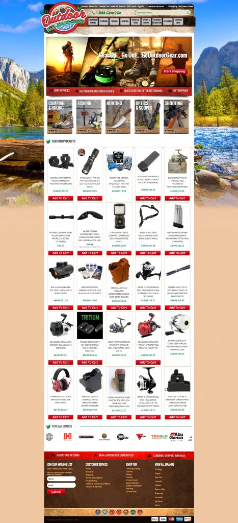
Go Outdoor Gear makes visitors feel like they’re already outdoors, which really adds to this brand’s persona. We love the earthy tones and nature activity photos we chose to help set this brand up for the perfect first impression. All of the categories are located at the top of the page, and also in picture form near the middle of the page to encourage clicks and indexing by search engines. Additional information (such as customer service, returns & refunds, etc.) is located at the very bottom of the storefront along with their different forms of accepted payment and social media icons, so that everything is easy for customers to find.
The above examples are just a taste of the type of excellence one can expect from the OCDesignsonline team on BigCommerce. Our design team works hard daily to give you the store that your brand needs. So don’t miss out on the chance to make your storefront the best it can be, request a free quote from OCDesignsonline today!

