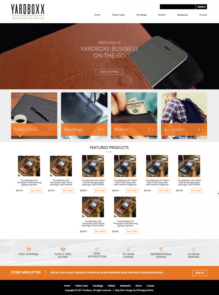
One of our recent clients, YardBoxx, asked for a sophisticated eBay design and we couldn’t have been happier to deliver. It ended up turning into one of our favorite designs. See below for a look into how we created this completely original and stunning eBay design.

YardBoxx sells tablet cases, wallets, backpacks, and more with the best materials. These are high-quality products! The design we created helps sell those products with its negative space, simplistic icons, value-adding footer, and more. Have you seen the logo we created? It’s engaging but not overbearing. The Welcome image we crafted also shares the goal of the store, “Business on-the-go,” and encourages shoppers to browse with its outlined button.
What eBay store designs need to succeed
All of the below are shown in the design we created for YardBoxx.
- A logo that is engaging but not distracting
- Featured Products to share price point and seasonal/new items
- Category clickable images to encourage browsing
- Negative space to make products stand out
- Call to Action buttons to increase average cart size
And there is even more that we can do for you at OCDesignsOnline. Take a look at some of our recent blog posts and then make sure to request a free quote from our team.
- White Space Designs
- Why you Need an eBay Listing Template
- eBay HTML designs
- Microsoft Trusted Us With Their eBay Store design
- eBay SEO – What is Casini?
Request a free quote now to get started
OCDesignsonline has a large portfolio of clients, spanning several years and platforms. Browse our portfolio to get a feel of our quality of work and then request your free website design quote. You want to see what we can do! Don’t forget to also follow us on our social media accounts: Facebook, Twitter, Google+, and Pinterest for more updates.

