Are you just about to launch your eBay store, and not sure how to create a powerful eBay template? Do you already have an eBay template designed, and wondering how to get even better results?
You’re in the right place. eBay is booming with opportunity for sellers; and it’s especially beneficial for sellers who know how to use effective design, powerful marketing, and real strategies.

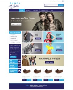
Example of an Effective eBay Template Design
As of the fourth quarter of 2017, eBay boasted 170 million active buyers, and 25 million sellers. Its new mobile shopping app has more than 15 million monthly users, and last year, the company’s annual net revenue was $9.6 billion.

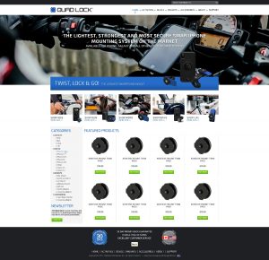
Sample of a Dynamic eBay Template Design
So, how can you harness the incredible power of eBay? Here are 8 easy ways to make sure your store stands out from the crowd, converts eager buyers, and finally, gets you the outstanding results you deserve.
8 Tips for a Game-Changing eBay Template
Follow these simple steps to ensure your eBay templates build your following, convert buyers, and quickly skyrocket your eBay store.
Craft a Dynamic Header
A critical part of your eBay store, your header is the first thing buyers see when they land on your page. Because of this, your header needs to make a dynamic first impression, while also being totally unforgettable. Your header is made up of three elements: your logo, service icons, and finally, a slogan. Have you included all these elements in your header? Does your header immediately capture attention and showcase your brand, while also compelling buyers to take action? Build a great header, and watch your conversion rates soar.
Make Your Gallery Irresistible
“The benefits of images for your eCommerce site are almost too numerous to list,” says an article in The Creative Momentum. And it’s true. Your gallery photos are a key way to wow shoppers, build trust, and convert sales. Because of this, it’s important to spend some dedicated time and energy taking dynamic, compelling, and accurate photos of your products. If it’s in your budget, professional photos are also one of the best investments you can make for your eBay template.
Use Your Logo
“A professional logo, a must, sets the tone for a professional listing,” says Etienne Amion, eBay design expert. And he’s right. Have you included your logo in your eBay template header? Does your logo convey your professionalism, and position you as a leader in your industry? Is it memorable and compelling? Using a great logo will generate brand recognition and build trust.
Every Panel Counts
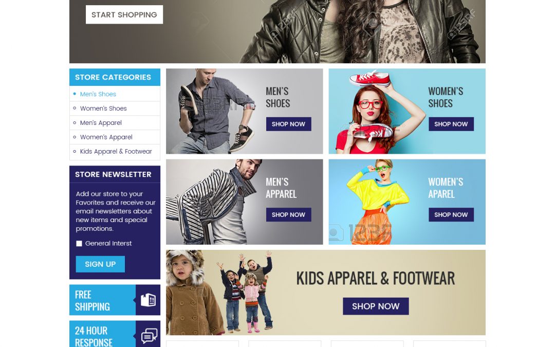
Do each of your eBay panels work together to create a visually appealing sales page? Are your panels dynamic as separate entities, while also cohesive as a whole? Every panel needs to be drafted, designed, and positioned to sell. Together, they should create a powerful visual effect that immediately conveys your brand identity and showcases your products.
Invest in the Visuals
According to Tyton Media, 38% of people will stop engaging with a website if the content/layout is unattractive. Are your visuals consistent throughout the page, or do they feel disjointed? Do the colors, font, and images you’ve chosen make your products stand out? Take a look at your eBay templates to ensure their visuals are cohesive, compelling, and designed to appeal to your specific target buyers.
Use Real Testimonials
Testimonials generate trust and build transparency – ensuring your new customers feel confident spending their money on your products. Do your testimonials speak volumes about your brand? Make sure you have genuine reviews from real, enthusiastic customers, and also encourage new buyers to leave testimonials of their own.
High Conversion Copy
“Copywriting is one of the most critical elements of any and all forms of marketing and advertising,” says an article on Hubspot. And it’s true. Do you have outstanding headlines, tag lines, descriptions, and CTAs? Does your copy speak directly to your target buyers? When you read your copy, does it perfectly showcase your products – making them impossible to resist? Remember that copy can make or break your eCommerce business – use it wisely.
Powerful Calls-to-Action
Are your calls-to-action placed consistently throughout your eBay page? And, do they compel people to purchase your product immediately? A successful CTA results in high conversion rates. Consequently, it’s essential to check your calls-to-action to ensure they are friendly, convincing, and urgent. In addition, frequently analyze your sales, and if results are low, try adjusting your CTA placement or text.
It’s Time to Launch Your Store!
As you know, eBay is a goldmine – for those who know how to use it well. Because of this, your business has endless opportunity at its fingertips. By crafting a killer eBay template with dynamic design, irresistible visuals, powerful copy, and great branding – your online business will rocket to the next level.
Need some expert guidance? We’re always here for you. Book a free online consultation, or give our friendly experts a call at 609-675-0912.
References:
https://www.statista.com/topics/2181/ebay/
https://expandedramblings.com/index.php/ebay-stats/
https://blog.hubspot.com/marketing/good-copywriting-practices-list
https://www.thecreativemomentum.com/blog/why-product-images-are-so-important-in-ecommerce


